How Custom Packaging Builds Brand Identity for Canadian Food Companies
Your packaging is your most powerful marketing tool at the point of sale. Here is how Canadian food brands use custom packaging to stand out on shelf, build loyalty, and command premium pricing.
How Custom Packaging Builds Brand Identity for Canadian Food Companies
Walk down any grocery aisle in Canada and you will see the same dynamic playing out across every category: the brands that win shelf space, consumer attention, and repeat purchases are the ones that have invested in packaging as a brand asset, not just a container.
For Canadian food companies, custom packaging is one of the highest-return investments you can make. It works 24 hours a day, seven days a week, at the exact moment a consumer is making a purchase decision.
This guide covers how to think about custom packaging strategically, what design elements drive purchase decisions, and how to work with a co-packer to bring your packaging vision to life.
Packaging Is Your Salesperson on Shelf
In a retail environment, your packaging has approximately three seconds to capture a shopper's attention, communicate your brand's value proposition, and trigger a purchase decision. There is no salesperson, no demo, no explanation, just the package.
This is why the world's most successful food brands invest heavily in packaging design. It is not vanity. It is the most cost-effective marketing channel available to a food company.
For Canadian brands, the stakes are particularly high. The Canadian grocery market is dominated by a small number of large retail chains, each with limited shelf space and high expectations for supplier performance. A poorly designed package gets delisted. A well-designed package gets reordered.
The Five Elements of Effective Food Packaging Design
1. Brand Architecture
Brand architecture is the system of visual elements, logo, colour palette, typography, graphic language, that makes your brand recognizable across your entire product line.
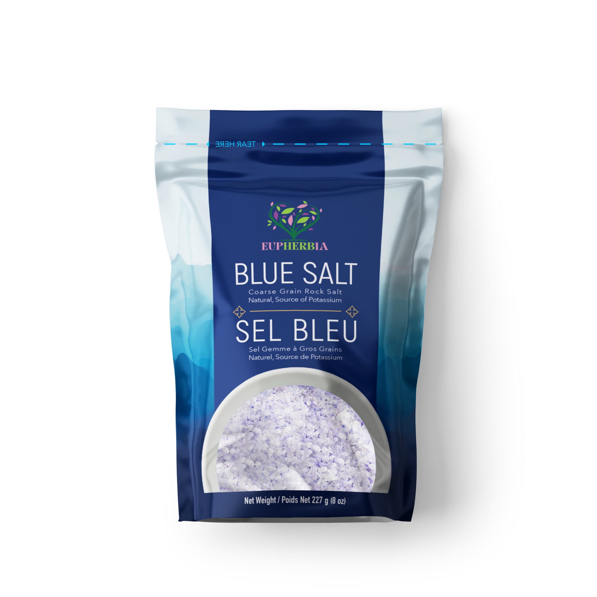
Strong brand architecture means a consumer can identify your brand from across the aisle, before they can read the product name. Think of the distinctive yellow of President's Choice, the clean white of Compliments, or the bold red of a leading hot sauce brand.
For private label and emerging brands, establishing a clear brand architecture from the start, even if you only have one or two SKUs, pays dividends as you scale. Every new product you add reinforces the brand rather than fragmenting it.
2. Hierarchy and Information Design
Packaging must communicate a lot of information in a small space: brand name, product name, variant, net weight, bilingual text, nutrition facts, ingredients, allergens, certifications, and more.
The best packaging designs establish a clear visual hierarchy that guides the eye from the most important information (brand, product) to supporting information (variant, claims) to mandatory information (nutrition, ingredients).
Poor information hierarchy, where everything competes for attention, results in packaging that feels cluttered and is hard to read. This is a common failure mode for brands that design packaging by committee or try to include too much on the front panel.
3. Colour Strategy
Colour is the most powerful tool in packaging design. It communicates category, flavour, quality tier, and brand personality before the consumer reads a single word.
In the spice and dry food categories, colour conventions are well established:
- Red and orange, heat, intensity, bold flavour (chili, paprika, cayenne)
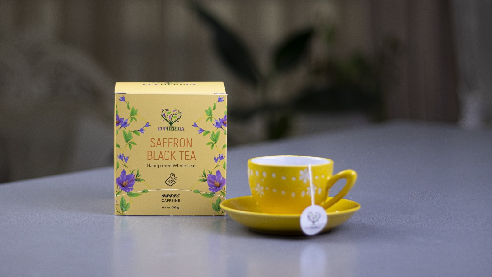
- Yellow and gold, warmth, richness, premium (turmeric, saffron, curry)
- Green, freshness, natural, herb-forward (basil, oregano, mint)
- Brown and kraft, natural, artisanal, unprocessed
- Black, premium, sophisticated, specialty
Breaking category colour conventions can work, but it requires strong execution and a clear strategic rationale. Consumers use colour as a shortcut. Defying the shortcut creates friction.
4. Typography
Typography communicates brand personality as powerfully as colour. A bold, condensed sans-serif says something different than an elegant serif. A hand-lettered script says something different than a geometric typeface.
For food packaging, legibility is non-negotiable, particularly for bilingual text, nutrition facts, and ingredient lists. But the display typography on the front panel is a brand expression opportunity.
Canadian food brands often underinvest in typography, defaulting to generic system fonts or overused commercial typefaces. A distinctive, well-chosen typeface is one of the most cost-effective ways to elevate packaging design.
5. Material and Format
The physical material and format of your packaging communicates quality before the consumer even reads the label. A kraft paper pouch signals natural and artisanal. A matte-finish flexible pouch signals premium. A glossy pillow bag signals value.
Choosing a packaging format and material that aligns with your brand positioning is as important as the graphic design. A premium spice brand in a cheap-looking pillow bag creates cognitive dissonance that undermines the brand.
Bilingual Design: Turning a Requirement Into an Asset
Canadian food labelling law requires bilingual (English and French) text on all packaged food sold nationally. For many brands, this is treated as a compliance burden, something to manage rather than leverage.
The most sophisticated Canadian food brands treat bilingual design differently. They use the bilingual requirement as a design element, integrating English and French text into the overall layout in a way that feels intentional and distinctly Canadian.
This approach has practical benefits beyond aesthetics:
- Quebec market access. Quebec represents approximately 23% of Canada's population and has a distinct retail landscape. Brands that design for bilingual retail from the start can access Quebec distribution without a label redesign.
- National brand identity. A well-executed bilingual label signals that a brand is genuinely Canadian, not an import with a compliance sticker. This matters to retailers and consumers who prioritize Canadian-made products.
Certifications and Claims: What to Put on the Front Panel
Certifications and claims on packaging front panels influence purchase decisions, but only if they are credible, relevant, and clearly communicated.
For dry food and spice brands in Canada, the most impactful front-panel claims include:
- SQF Certified, signals food safety rigour to trade buyers and sophisticated consumers.
- Non-GMO, relevant for grain, legume, and spice categories where GMO status is a consumer concern.
- Organic, requires CFIA-recognized organic certification. Commands a significant price premium in the right retail channels.
- Gluten-Free, high consumer demand across multiple categories. Requires testing and documentation to support the claim.
- Kosher / Halal, essential for brands targeting Jewish and Muslim consumer segments, which are significant in the GTA market.
- Product of Canada / Made in Canada, CFIA has specific rules for these claims. "Product of Canada" requires that all significant ingredients and processing occur in Canada. "Made in Canada" allows for imported ingredients with Canadian processing.
Working With a Co-Packer on Custom Packaging
Bringing custom packaging to life requires close collaboration between your brand team and your co-packer. Here is how to make the process efficient:
- Start with a brief. Before engaging a designer, document your brand positioning, target consumer, retail channel, competitive set, and packaging format requirements. A clear brief produces better design and fewer revision cycles.
- Get dieline templates early. Your co-packer can provide dieline templates (technical drawings showing the exact dimensions and fold lines of each packaging format) before you start design. Designing to the dieline from the start avoids costly revisions later.
- Plan for bilingual from day one. Do not design in English and translate later. Build the bilingual layout into the initial design concept.
- Request a physical sample before full production. Colour accuracy, finish quality, and label placement can only be verified on a physical sample. Always approve a sample before committing to a full production run.
- Build in lead time. Custom-printed packaging typically requires 6–10 weeks from artwork approval to delivery. Plan your launch timeline accordingly.
Cana Prime Food: Custom Packaging for Canadian Food Brands
Cana Prime Food has been producing custom private label spice packaging and dry food co-packing for Canadian brands since 2004. Our Toronto facility is SQF Level 2 certified and equipped for custom format production across flexible pouches, bulk bags, and specialty formats. As a trusted dry food co-packer in Toronto, we work with brands at every stage — from first-time private label launches to established brands scaling their packaging operations.
Request a quote or contact our team to discuss your custom packaging project. Learn more about our private label services or explore our product range.
Explore Topics
Written by
Cana Prime Food Team
Content creator and writer sharing insights and stories.